
..

Crafting the future of
real estate intelligence
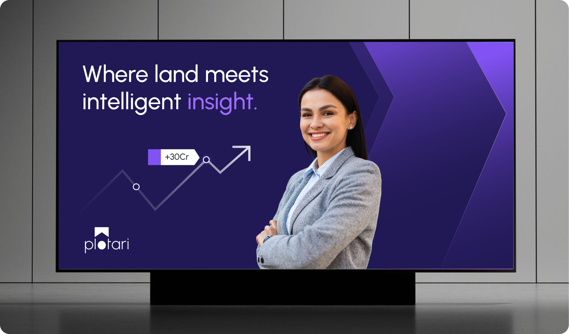
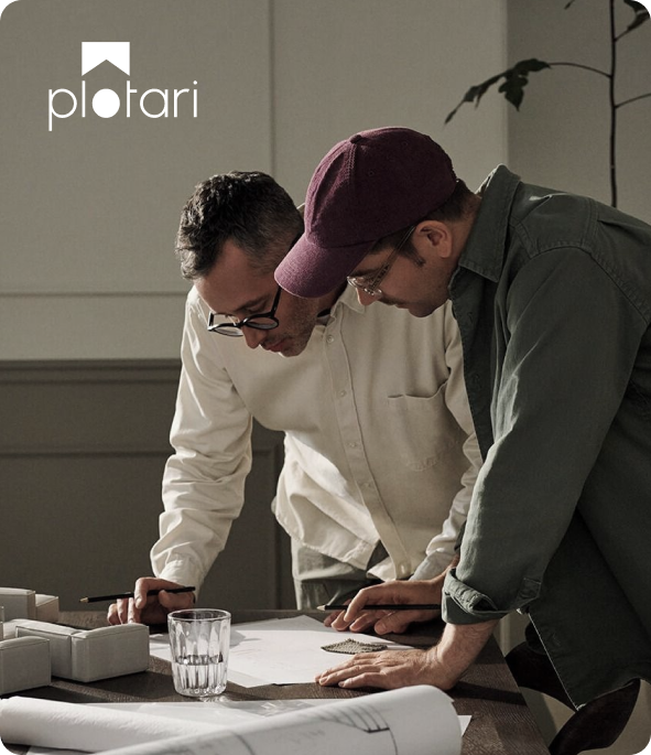
We partnered with Plotari to shape a brand that brings clarity and confidence to one of the most complex purchases which is land.
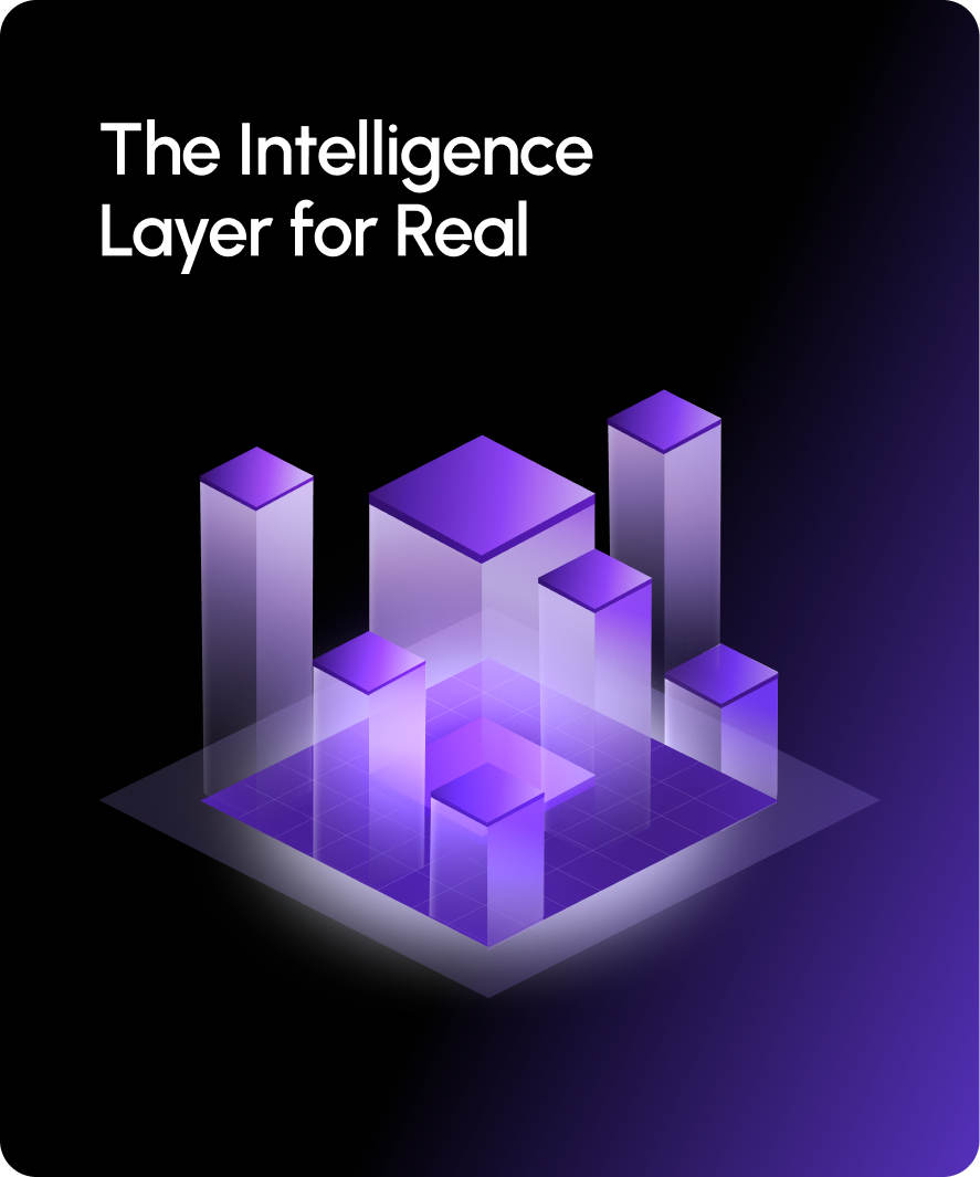
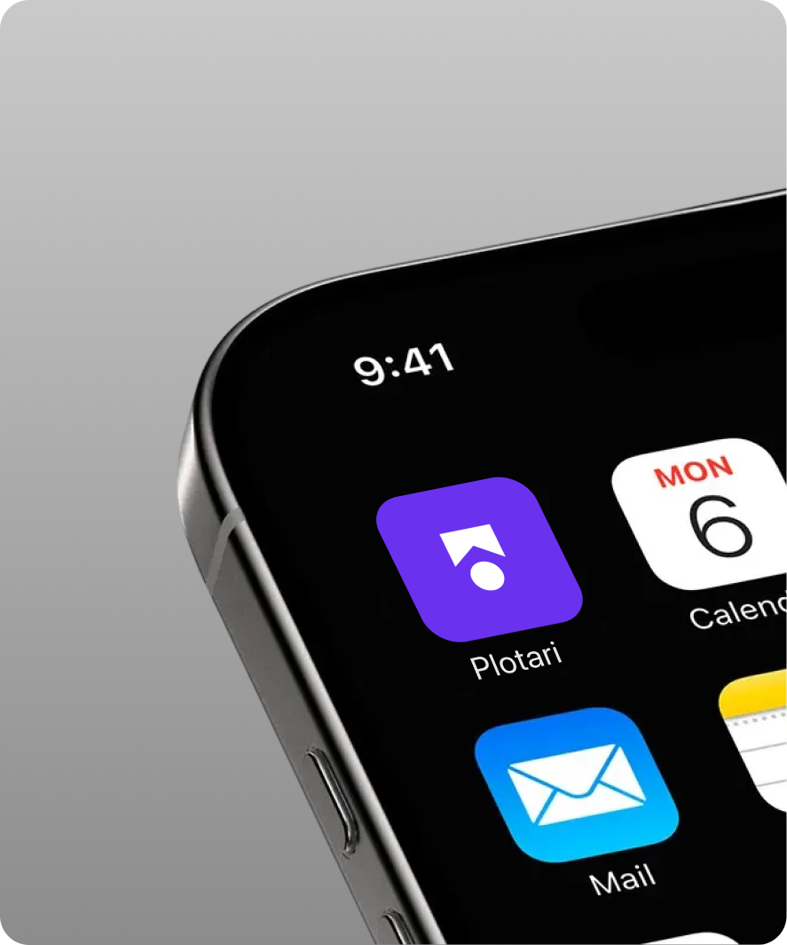
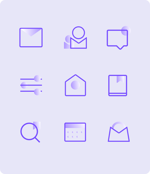
The visual language is built on structured grids, bold geometry, and modular compositions mirroring plotted land while echoing the precision of digital systems. The logo distills this idea into a simple, memorable mark, where a grounded circular form meets a directional, plot-like accent. The result is a brand that doesn’t just look modern, but makes the experience of buying land feel clearer, more accessible, and inherently intuitive.
BRANDING
Identity/ Brand Story
Creative/ Art Direction
Illustration/ Iconography
Brand Guidelines



Made with thought, love & care by Liquidink Design
Plotari Team
Ami
Gopi
Liquidink Design Team
Aayushi
Nitya
Ranga